Visualizing Free Stock Data for Algorithmic Trading with Python and Matplotlib
In this article, I will show you how to pull historical stock price data with the IEX API. I will then help you plot moving averages and Bollinger Bands.
In some of my previous articles, I explain why IEX is a useful API and how to set up an environment for financial research.
Technical Analysis
Technical analysis is a method of analyzing stock data in order to make educated predictions on price trends and movements. When juxtaposed with fundamental analysis, technical analysis lives within charts, and it breaths with statistics. Both technical and fundamental analysis can be used when evaluating a stock, and each method has its own strengths.
The goal of technical analysis is to provide some sort of insight into future price movement. There are a surplus of different types of charts and statistics that offer valuable information in reference to support, resistance, signals, and trends. In this article, I focus solely on two indicators, moving averages and Bollinger Bands. In later articles, I aim to develop a trading strategy involving technical analysis.
Setup
To setup the environment properly, you will also need to install pandas, datetime, and matplotlib by running:
pip install pandas datetime matplotlibAt the start of your program, copy and paste:
import pandas as pd
from iexfinance.stocks import Stock
from datetime import datetime
import matplotlib.pyplot as plt
from iexfinance.stocks import get_historical_data
Pulling Historical Prices
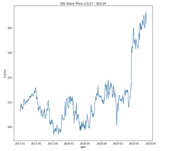
I chose to analyze the Disney stock price over the past two years. Disney has been in the news frequently and the stock price has seen massive swings over the course of two years, so the choice was made for the purpose of visualization.
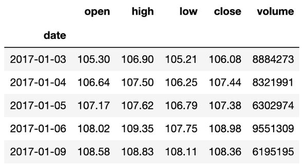
The IEX API requires datetime dates to pull historical prices. In the lines below, I initialize the date range and request the output to be formatted to a pandas DataFrame.
start = datetime(2017, 1, 1)
end = datetime(2019, 8, 1)
df = get_historical_data("DIS", start, end, output_format='pandas')
Initial Plot
If you have read any of my other articles, the steps to this point should have been second nature. Pandas has built in support for matplotlib, so plotting the historical prices is incredibly easy. Below, I plot the historical price of Disney stock:
df['close'].plot()Since all graphs should have context, below I add labels to the graph:
plt.figure(figsize=(10,10))
plt.plot(df.index, df['close'])
plt.xlabel("date")
plt.ylabel("$ price")
plt.title("DIS Stock Price 1/1/17 - 8/1/19")
… on to the Good Part
Although plotting the historical prices can be seen as an achievement, analysis is limited with one feature. As promised, I will now demonstrate how to add statistics to the chart, for the development of a more informed trading strategy.
Moving Averages
The first new feature I will plot is a moving average. A moving average is an indicator that smooths the volatility of daily price changes. A technical analyst chooses a window for the average and a corresponding dataset is computed.
There are different types of moving averages, but the most common is the simple moving average. A simple moving average is the arithmetic mean over a number of specific time periods (the window) [1]. The window can be arbitrarily chosen, but there are recommendations on which window to use and how many to use.
Another common form of moving average is the exponential moving average. The formula for calculating the exponential moving average is a little more complex, but its goal is to further smooth out the noise of daily price changes.
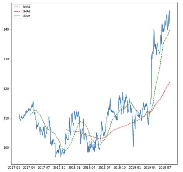
Pandas makes it incredibly easy to add new columns to a DataFrame, so adding the moving average is a breeze. Below, I add two more columns to the DataFrame — one for a moving average of 50 days, and another for a moving average of 200 days:
df["SMA1"] = df['close'].rolling(window=50).mean()
df["SMA2"] = df['close'].rolling(window=200).mean()
What good are the columns without a graph?
plt.figure(figsize=(10,10))
plt.plot(df['SMA1'], 'g--', label="SMA1")
plt.plot(df['SMA2'], 'r--', label="SMA2")
plt.plot(df['close'], label="close")
plt.legend()
plt.show()
Are the Lines Supposed to Cross?
Aha! If you are paying attention and have been following along, you may have noticed that the line for the 50-day simple moving average and the line for the 200-day moving average cross. The crossover of the two moving averages forms the basis of the moving average crossover trading strategy.
The crossover of the two lines signals that it may be smart to take a certain position. Typically, when the shorter term moving average crosses above the longer moving average, it is an indication to buy. If the shorter term moves below the long term, it is an indication to sell.
If you can’t hold your horses and want a little more code to play around with, check out the snippet below to add the 20-day exponential moving average to the chart.
df['ewma'] = df['close'].ewm(halflife=0.5, min_periods=20).mean()Bollinger Bands
Next up, we have Bollinger Bands. Trading with Bollinger Bands can be a little harder to conceptualize. There are three different Bollinger Bands:
1. Middle Band= 20-day simple moving average (SMA)
2. Upper Band= 20-day SMA+(20-day standard deviation of price x 2)
3. Lower Band= 20-day SMA–(20-day standard deviation of price x 2)
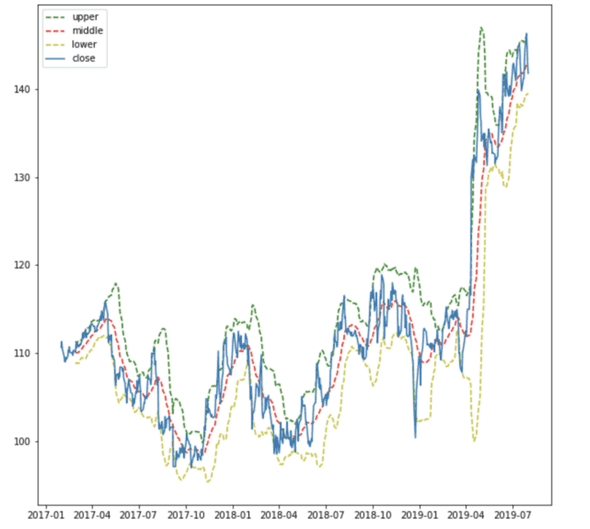
Bollinger Bands illustrate the relative strength or momentum of a stock [2]. Bollinger Bands act as an envelope around the price of a stock. The bands are more complicated, but they provide more insight than just using the moving average. Below, I create the three bands as new entries in the DataFrame.
df['middle_band'] = df['close'].rolling(window=20).mean()
df['upper_band'] = df['close'].rolling(window=20).mean() + df['close'].rolling(window=20).std()*2
df['lower_band'] = df['close'].rolling(window=20).mean() - df['close'].rolling(window=20).std()*2
… and the plot
plt.figure(figsize=(10,10))
plt.plot(df['upper_band'], 'g--', label="upper")
plt.plot(df['middle_band'], 'r--', label="middle")
plt.plot(df['lower_band'], 'y--', label="lower")
plt.plot(df['close'], label="close")
plt.legend()
plt.show()
Confused???
At first, visualizing the Bollinger Bands provides seems confusing and overcrowded. Typically, when the price of the stock is considered relatively low (attractive), it is near the lower band, and if the stock is relatively high (overvalued), it’s near the upper band. Since the bands are an assessment of strength, the bands are often used with another indicator, to make an informed decision about a position.
Making Sense Now?
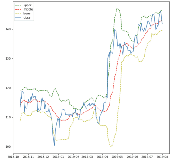
Bollinger Bands are also a great indicator into the volatility of a stock. If you refer to the previous chart, the Disney stock price skyrockets around April 2019.
Below, I provide code that zooms in on the past 200 days of trading:
plt.figure(figsize=(10,10))
plt.plot(df['upper_band'].iloc[-200:], 'g--', label="upper")
plt.plot(df['middle_band'].iloc[-200:], 'r--', label="middle")
plt.plot(df['lower_band'].iloc[-200:], 'y--', label="lower")
plt.plot(df['close'].iloc[-200:], label="close")
plt.legend()
plt.show()
Can We use Technical Analysis to Explain the Spike?
Survey says… yes!
A Bollinger Band “squeeze” occurs when volatility reaches a relative low in the context of recent price action (the bands converge). If a squeeze occurs with the bands, it is an indication that a period of increased volatility will follow. The only problem is that the significant move maybe to the upside or the downside.
At the end of March 2019, it is clear that a squeeze occurs. The squeeze is then followed by a strong positive movement. Pretty cool, Huh?
Full Code
//Imports
import pandas as pd
from iexfinance.stocks import Stock
from datetime import datetime
import matplotlib.pyplot as plt
from iexfinance.stocks import get_historical_data

//Pulling and Plotting Historical Prices
start = datetime(2017, 1, 1)
end = datetime(2019, 8, 1)
df = get_historical_data("DIS", start, end, output_format='pandas')
plt.figure(figsize=(10,10))
plt.plot(df.index, df['close'])
plt.xlabel("date")
plt.ylabel("$ price")
plt.title("DIS Stock Price 1/1/17 - 8/1/19")

//Creating and Plotting Moving Averages
df["SMA1"] = df['close'].rolling(window=50).mean()
df["SMA2"] = df['close'].rolling(window=200).mean()
df['ewma'] = df['close'].ewm(halflife=0.5, min_periods=20).mean()
plt.figure(figsize=(10,10))
plt.plot(df['SMA1'], 'g--', label="SMA1")
plt.plot(df['SMA2'], 'r--', label="SMA2")
plt.plot(df['close'], label="close")
plt.legend()
plt.show()

//Creating and Plotting Bollinger Bands
df['middle_band'] = df['close'].rolling(window=20).mean()
df['upper_band'] = df['close'].rolling(window=20).mean() + df['close'].rolling(window=20).std()*2
df['lower_band'] = df['close'].rolling(window=20).mean() - df['close'].rolling(window=20).std()*2
plt.figure(figsize=(10,10))
plt.plot(df['upper_band'], 'g--', label="upper")
plt.plot(df['middle_band'], 'r--', label="middle")
plt.plot(df['lower_band'], 'y--', label="lower")
plt.plot(df['close'], label="close")
plt.legend()
plt.show()

plt.figure(figsize=(10,10))
plt.plot(df['upper_band'].iloc[-200:], 'g--', label="upper")
plt.plot(df['middle_band'].iloc[-200:], 'r--', label="middle")
plt.plot(df['lower_band'].iloc[-200:], 'y--', label="lower")
plt.plot(df['close'].iloc[-200:], label="close")
plt.legend()
plt.show()
Wrapping Up
Technical analysis is a broad field with a formidable amount of unique indicators. Using moving averages and Bollinger Bands can help improve a trading strategy. Thank you for reading and keep learning!
References
[1] How to Use a Moving Average
[2] Complete Explanation of Bollinger Bands
